Styling Tipp Fashion und Beauty 2013 – Pink, Print und gemustert durch die Hauptstadt (+english version)
Scroll down for english version
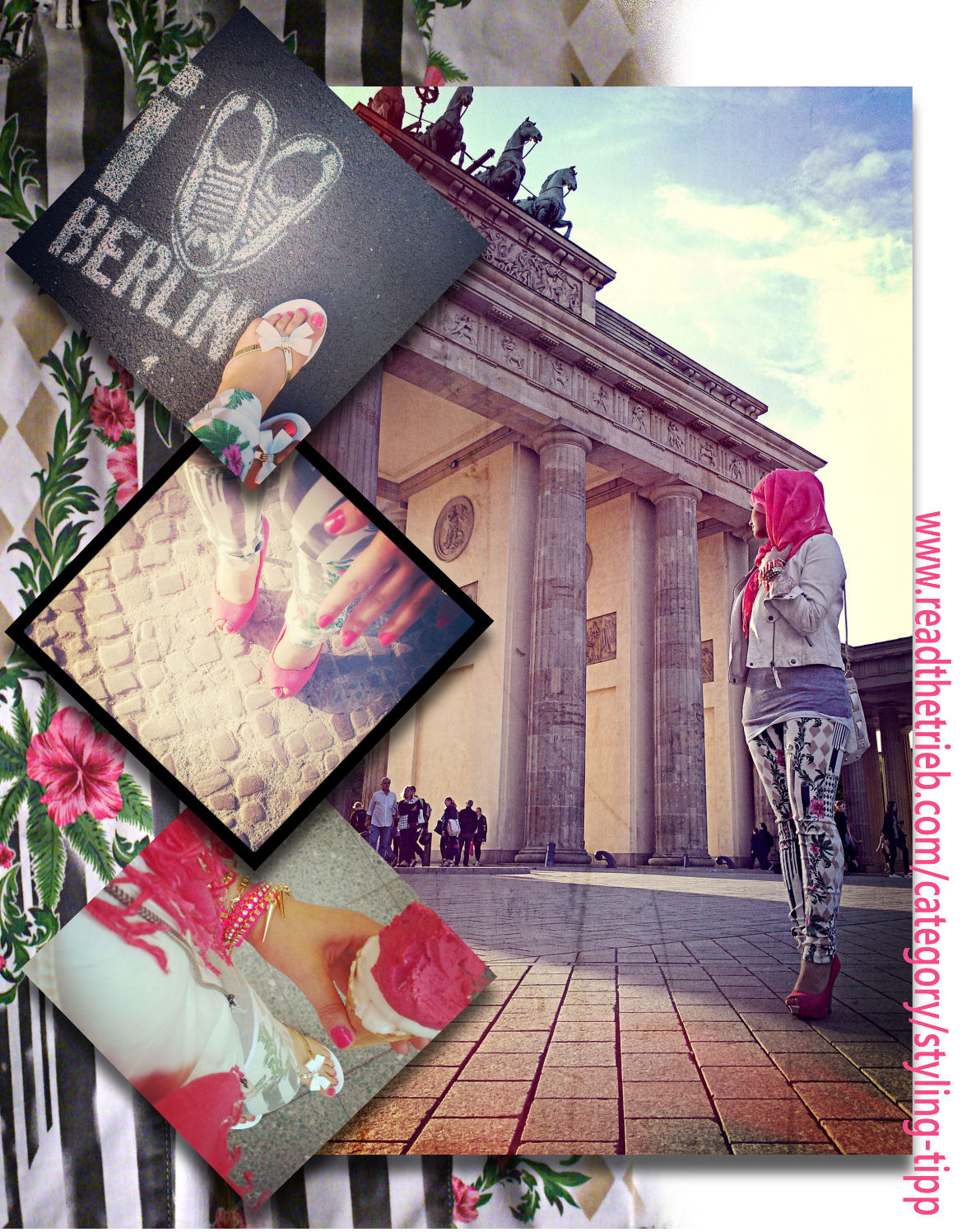
Bereits im Letzten Styling-Tipp habe ich erwähnt, dass Prints sehr im Trend liegen für diesen Sommer. Die Hose, die ich trage passt daher perfekt in unseren heutigen Style. Ich war am Mittwoch am Brandenburger Tor und wollte die Sonne genießen, ein bisschen spazieren gehen und hatte Lust, mich schick anstatt Casual anzuziehen. Mit einen paar wenigen Schritten könnt ihr das auch umsetzen, man muss dabei nur auf ein paar Sachen achten.
1. Der Print meiner Hose ist sehr auffallend und dominant, deswegen habe ich sie nur noch mit einfarbigen Sachen kombiniert. Pink kommt auch in den Blüten auf meiner Hose vor und es ist immer noch im Trend. Und da es einen fruchtigen, frischen Kontrast bildet zu dem strahlenden Weiß, habe ich mich dafür entschieden und mein Styling dem Pinken angepasst.
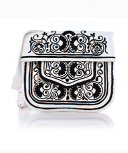
2. Passend zur weißen Hose trage ich eine weiße Lederjacke und eine weiße Tasche. Passend zum Pink-Trend und den pinken Blüten auf der Hose habe ich ein pinkes Kopftuch, pinken Armschmuck mit rockigen, goldenen Stachelnieten, pinke Peep Toes und gleichfarbigen Nagellack.
3. Um das Outfit farblich abzurunden habe ich für die Körpermitte ein farblich dezentes Tank-Top in Grau gewählt, das ich über einen weißen Tank-Top gezogen habe. Wenn man genau hinschaut, kommt auch etwas Grau in meiner Hose vor.
4. Da ich lange unterwegs war habe ich vorsichtshalber Flip Flops eingesteckt. Sie sind weiß, passen also zur Hose, Tasche und zum weißen Pullover. Sie sind verspielt, deswegen kontrastreich zum wilden Blumenprint. Und sie haben goldene Riemchen, passend zu den goldenen Stachelnieten meines pinken Armbandes.
5. Mein Outfit hat zwar nur 4 Farben mit mehr oder minder dominierenden Farben (Weiß, Pink, Grau und Gold), wobei Weiß und Pink den Löwenanteil ausmachen. Aber man muss gut kombinieren können, damit solche auffallenden Print-Trends nicht kitschig aussehen.
Deswegen achte ich immer darauf, eine sogenannte “farbliche Brücke” in meinen Outfits zu bauen. Das heißt, das Farbspiel auf eurem gesamten Körper sollte ausgeglichen sein. Es gibt einen Schwerpunkt, das ist die Print-Hose, die Basis ist Weiß und ich peppe alles auf mit Pink. Deswegen achte ich darauf, dass sich die Farben immer wieder aufgreifen und baue eine farbliche Brücke vom Scheitel bis zur Sohle. Die Riemchen meiner weißen Flip Flops sind gold, also nehme ich ein Armband mit goldenen Nieten, auch wenn ich sonst nichts Goldfarbenes an mir habe. Un das Pink ist zwar genau wie das Weiß überall, aber ich achte darauf, wie es sich verteilt. Schwerpunkt auf den Peep Toes und den Nägeln, dann den Pinkanteil wieder minimieren (Blüten in der Hose). Mein pinkes Armband bildet eine pinke Brücke, bis ich wieder bei meinem pinken Schwerpunkt am Kopf angekommen bin.
6. Weil ich ein Kopftuch trage, experimentiere ich gern mit stylischen Kopftüchern in verschiedenen Farben. Das Outfit sieht auch sehr gut aus, wenn man kein Kopftuch trägt, sondern sich einen pinken, schmalen Schal über die Schultern wirft. Oder eines von diesen großen quadratischen Tüchern, die man zu einem halb so großen Dreieck zusammenlegt und sich dann ganz leicht um den Hals wickelt.
Das Highlight an diesem sonnigen Tag war mein Eis!! Und wie gut es zu meinem Outfit passt ![]() Das war allerdings nur Zufall.
Das war allerdings nur Zufall.
Bildrechte: Readthetrieb
English version
In my last “Styling-Tipp“ article I already mentioned that prints are very à la mode at the moment for this summer. The pants, which I’m wearing, therefore, are perfect for style which I’m presenting to you today. Last Wednesday I went to the Brandenburger Tor to enjoy the sun, to go for a walk and because I felt like wearing chic clothing instead of a casual style. With just a few styling step, you can achieve the following look. You just have to pay attention to some things.
1. The print of my pants is very eye-catching and dominant. For this reason, I combined it with plain-colored clothing. The color pink can be found on the flowers on my pants, this color is absolutely trendy at the moment. And since it creates a juicy and fresh contrast to the bright white, I decided to adjust my entire color to emphasizing the color pink.
2. Matching my mainly white pants, I’m wearing a white leather jacket and a white bag. Following the pink trend and underlining the pink flowers on my pants, I wore a pink headscarf, pink bracelets with rocking golden spikey studs, pink peep-toes and same-colored nail polish.
3. In order to perfect the color harmony in my outfit, I wore a colorfully rather discreet tank top in grey, which I donned above my white tank top. If you take a closer look, you can see that the color grey can also be found in my pants.
4. Since I went out the entire day, I put a pair of flip flops in my bag just in case. They are white, matching the pants, my bag and my white pullover. The flip flops are also very playful, which harmonizes perfectly with the wild flower prints. Furthermore, they are embellished with golden bands, which goes well with my golden spikey studs of my pink wristband.
5. My outfit has only 4 colors with very contrasting colors white, pink, grey and gold, white being the most dominant color. However, you have to be careful when combining garments in order to avoid your outfit to look cheesy, especially considering the prints.
That’s why I always make sure to build a bridge between all the colors in my outfits. This means that the color play of your entire outfit has to be balanced somehow. However, you should focus on one particular garment or color. In my outfit, the focus is placed on my print pants whose base is white and which I elevate with the color pink. What is important as well is the distribution of the colors. The color pink can be found in many elements of my clothing, including my peep-toes, my finger nails, and the flowers on my pants, my wristband and my headscarf. I think that my pink wristband in particular builds a bridge from the pink in my bottom part of my outfit to my pink headscarf.
6. Since I’m wearing a headscarf, I like experimenting with stylish colors and prints on this essential hair accessory. But the outfit will look great as well, if you are not wearing a headscarf. Just throw over a pink scarf around your neck or one of the big square kerchiefs which you can fold to a triangle to wrap it around your neck.
All in all, I would say that the highlight of my day and my outfit was the ice cream I could indulge in! Its color really matched my outfit, but this was coincidence.
Copyright: Readthetrieb